
Småtrollen
A homely kindergarten in Göteborg
Introduction
Småtrollen
We have been working on designing a new website for Småtrollen. Småtrollen is a parenting cooperative that focuses on sustainability, nature, and creating an educational environment for their children. Since the cooperative is volunteer-based, they requested a cheap and easy-to-maintain website.
UNDERSTANDING THE USER

Our client was the kindergarten, and we primarily interacted with two of their representatives from the parent-teacher council. They wanted a website that acted as a funnel for first-time visitor parents looking for a kindergarten for their children to contact the school itself. The school felt confident in their ability to guide and tour parents at their school in person and wanted to focus on their strengths.
All internal communication between the school and parents are done through an app, so this website was just for initial parental recruitment into the kindergarten program.
Process


UX Research: what seems to be the problem?
The first thing we did was to delve deep down into what they needed, and create time estimations and To-Do lists in Trello. We then did a heuristic evaluation where we piece by piece broke down the pros and cons of the old website and its design errors and strengths. We focused on four heuristics: visibility of system status, match between system and real world, consistency and standards, and aesthetics and minimalist design.
Interviews: Understanding needs
We then conducted interviews and Q&A sessions with the school's representatives to understand their likes, dislikes, needs, and preferences for the old design. We found that they wanted a simple-to-maintain website that would remain untouched for another 15 years.
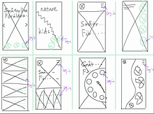
They also desired an intimate atmosphere of a small collective preschool and wanted to feature nature pictures. Using this information, we brainstormed ideas and created sketches for the new website. We had many ideas, but we chose to discard those that would require too much code or maintenance. The school's preference was simplicity, smoothness, and a nature-oriented design, which was our focus.
Photography Time: say "smile!"
With a vision of nature-focused, streamlined, and minimalist design, we began constructing the framework. We decided on which pages to include (Welcome page, About us, contact section, menu, etc.), and what should be under each subsection. This subdivision of work allowed us to collaborate efficiently without redoing each section repeatedly.
Information Architecture: making a structure
So with an idea of what we were going with, lots of nature pictures, streamlined, and minimalistc design, we started creating the framwork. We went ahead and decided on what pages to include (Welcome page, About us, contact section, menu, etc), and what should be under each subsection. This was so that we could subdivide the work between the four of us and more easily work together and not have to redo each section every time we reviewed eachothers work. Because of the time limitations, we decided to go straight for High-Fidelity wireframes and prioritise speed.
Last sprint
To test our product, we developed an interactive prototype in Figma. This allowed us to conduct internal testing for a more comprehensive and streamlined user experience. Unfortunately, due to time constraints, we couldn't conduct usability tests with real users and could only perform quick internal testing.
The final product differed significantly from Småtrollen's original website. It featured large, vibrant pictures, streamlined content, fonts specifically chosen for phone readability, and more. This approach ensured that the website was not only visually appealing but also conveyed the essence of the kindergarten to first-time visitors.
Finally, we presented our findings in person to the Småtrollen representatives, explaining our thought process and design choices.

What we learned
Start with the end in mind
One of the best things we did was interview Småtrollen and finding out what really mattered, and then using that to create a skeleton of what should be in the website.
Kill your darlings
During the project we had to work fast, but we also had to scratch slides and rearrange content that did not end up fitting. Things we worked hard on, but were ultimately better off without.
Plan for the unexpected
Time, it all takes so much time. We had group members getting sick, pregnancy aches, and emergencies. We should have had more plans for what if scenarios.


